Being motivated by my personal passion for notebooks and based on user research methods I developed a brand for notebooks. The idea builds upon offering a set of four books each year to people who use notebooks regularly.
Four is a number that feels naturally connected to the seasons, which make a year. The pages are blank and give enough space to reflect on a personal development within a period of time. Feel free to skip pages and add scribbles and notes where ever it feels right, three coloured bookmarks help to find them again.
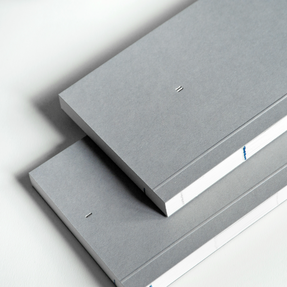
The simple and clean designed notebooks are crafted in high quality with woodfree paper. Its neutral and rough appearance eases the personal connection between the user and the notebook – like a blank page that gets filled with personality.
The open spine provides a plain and convenient way of opening the notebooks. The blue thread in the stitching is not only an eyecatcher but gives orientation to sort the books in the right order in the shelf and keeps them together to represent a year. Each year the colour of the thread will change to keep the set of four books together.
The idea of the logo builds upon roman numerals, but transforms the regular IV into IIII to visually represent four books standing in a shelf.